 前端里
前端里最近给大家分享 CSS3 效果比较多,都是充分运用了 CSS3 来实现的。通过 CSS3 的新特性,我们创作出好的交互和效果的可能性大大增加。这篇文章中,我想与大家分享使用 CSS3 过渡特性实现的信封效果的联系表单。

CSS3 代码:
#form_wrap { overflow:hidden; height:446px; position:relative; top:0px; -webkit-transition: all 1s ease-in-out .3s; -moz-transition: all 1s ease-in-out .3s; -o-transition: all 1s ease-in-out .3s; transition: all 1s ease-in-out .3s;} #form_wrap:before {content:""; position:absolute; bottom:128px;left:0px; background:url('images/before.png'); width:530px;height: 316px;} #form_wrap:after {content:"";position:absolute; bottom:0px;left:0; background:url('images/after.png'); width:530px;height: 260px; } #form_wrap.hide:after, #form_wrap.hide:before {display:none; } #form_wrap:hover {height:776px;top:-200px;} form {background:#f7f2ec url('images/letter_bg.png'); position:relative;top:200px;overflow:hidden; height:200px;width:400px;margin:0px auto;padding:20px; border: 1px solid #fff; border-radius: 3px; -moz-border-radius: 3px; -webkit-border-radius: 3px; box-shadow: 0px 0px 3px #9d9d9d, inset 0px 0px 27px #fff; -moz-box-shadow: 0px 0px 3px #9d9d9d, inset 0px 0px 14px #fff; -webkit-box-shadow: 0px 0px 3px #9d9d9d, inset 0px 0px 27px #fff; -webkit-transition: all 1s ease-in-out .3s; -moz-transition: all 1s ease-in-out .3s; -o-transition: all 1s ease-in-out .3s; transition: all 1s ease-in-out .3s;} #form_wrap:hover form {height:530px;} label { margin: 11px 20px 0 0; font-size: 16px; color: #b3aba1; text-transform: uppercase; text-shadow: 0px 1px 0px #fff; } input[type=text], textarea { font: 14px normal normal uppercase helvetica, arial, serif; color: #7c7873;background:none; width: 380px; height: 36px; padding: 0px 10px; margin: 0 0 10px 0; border:1px solid #f8f5f1; -moz-border-radius: 5px; -webkit-border-radius: 5px; border-radius: 5px; -moz-box-shadow: inset 0px 0px 1px #726959; -webkit-box-shadow: inset 0px 0px 1px #b3a895; box-shadow: inset 0px 0px 1px #b3a895; } textarea { height: 80px; padding-top:14px;} textarea:focus, input[type=text]:focus {background:rgba(255,255,255,.35);} #form_wrap input[type=submit] { position:relative;font-family: 'YanoneKaffeesatzRegular'; font-size:24px; color: #7c7873;text-shadow:0 1px 0 #fff; width:100%; text-align:center;opacity:0; background:none; cursor: pointer; -moz-border-radius: 3px; -webkit-border-radius: 3px; border-radius: 3px; -webkit-transition: opacity .6s ease-in-out 0s; -moz-transition: opacity .6s ease-in-out 0s; -o-transition: opacity .6s ease-in-out 0s; transition: opacity .6s ease-in-out 0s; } #form_wrap:hover input[type=submit] {z-index:1;opacity:1; -webkit-transition: opacity .5s ease-in-out 1.3s; -moz-transition: opacity .5s ease-in-out 1.3s; -o-transition: opacity .5s ease-in-out 1.3s; transition: opacity .5s ease-in-out 1.3s;} #form_wrap:hover input:hover[type=submit] {color:#435c70;}
您可能感兴趣的相关文章

 实现移动端Retina屏幕1px边框的7种方法
 Scrollanim – CSS3 & JavaScript 创建滚动动画
 一组网页边栏过渡动画【附源码下载】
 35个让人惊讶的 CSS3 动画效果演示
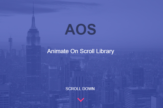 AOS – 另外一个独特的页面滚动动画库(CSS3)